Chip In
Brief
What will the banking industry look like in 25 years' time?
Introduction to project
During my second year of college, we were instructed that we were to undertake group projects on behalf of JP Morgan. We got into groups of 5 and were given our brief. We were told that we had 6 weeks to create a presentation that we would show to JP Morgan and the other groups in the class. The brief was to explore the question 'What will the banking industry look like in 25 years' time?'.
Our group decided that we wanted to go down the user experience route. We looked at what is currently out their with mobile banking and what developments are currently going on in the tech industry.
Market research
We realised that the predominant shift in the banking industry currently was the move from high-street banking to mobile only banking. This replicated the downfall of the high-street with most retail shops closing their physical stores as they are experiencing low levels of demand. This was accelerated by the pandemic which forced the closure of physical stores. In addition to this, the pandemic meant that physical money was becoming increasingly obsolete as there were hygiene concerns with touching physical money so contactless payments became commonplace for consumers.
However, whilst contactless payments through mobile phones helped reduce the transfer of bacteria via cash but it doesn't eliminate it completely. With using mobile phones for payment, you are still touching it constantly as well as when your phone touches the card reader. However this can be eliminated with NRFID chips.
These chips are inserted in between your thumb and forefinger and can have any data stored on them that you require. The option of using this for payments is currently being researched and Steve Northam (founder of BioTech) is currently in talks with MasterCard and Visa to discuss this possibility for future developments of the chips. We took this idea and the knowledge of the current state of the financial services industry and came up with the idea of Chip In.

Our Idea
Chip In would be a banking experience. Goodbye are the days of mundane banking and boring admin work. We would be creating an experience in which the users would be able to visualise their banking through wearable technology such as glasses where they would be able to get an in-depth understanding with just a quick glance.
App Design
As mentioned above, in order to demonstrate the basic design of the experience, we had to use current banking apps as our template for the format.
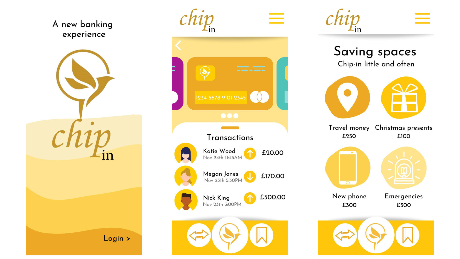
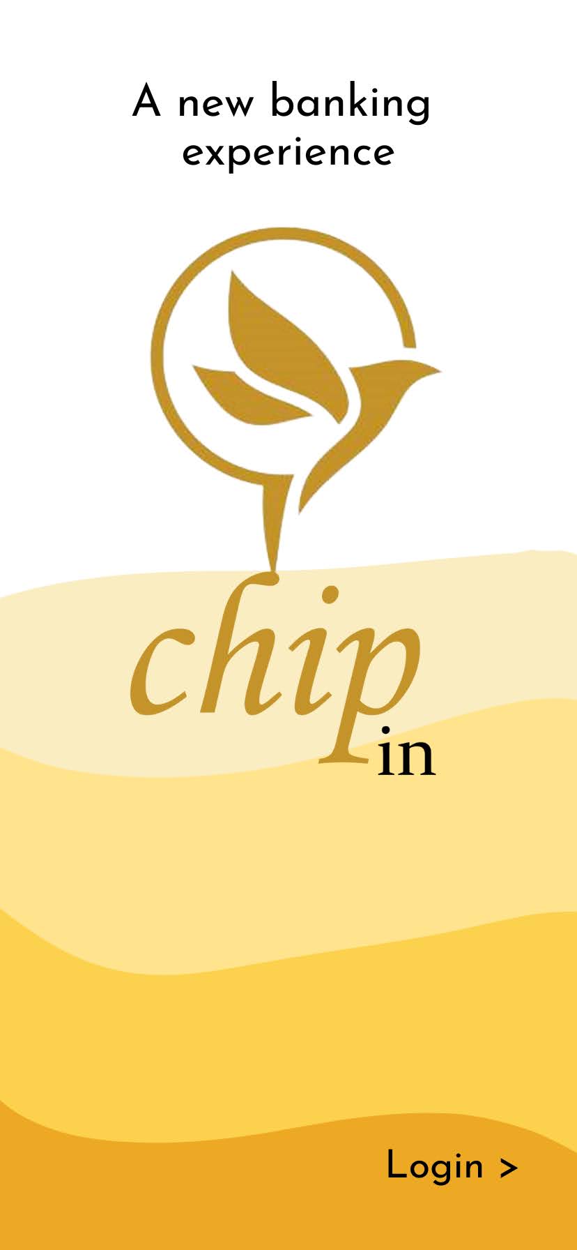
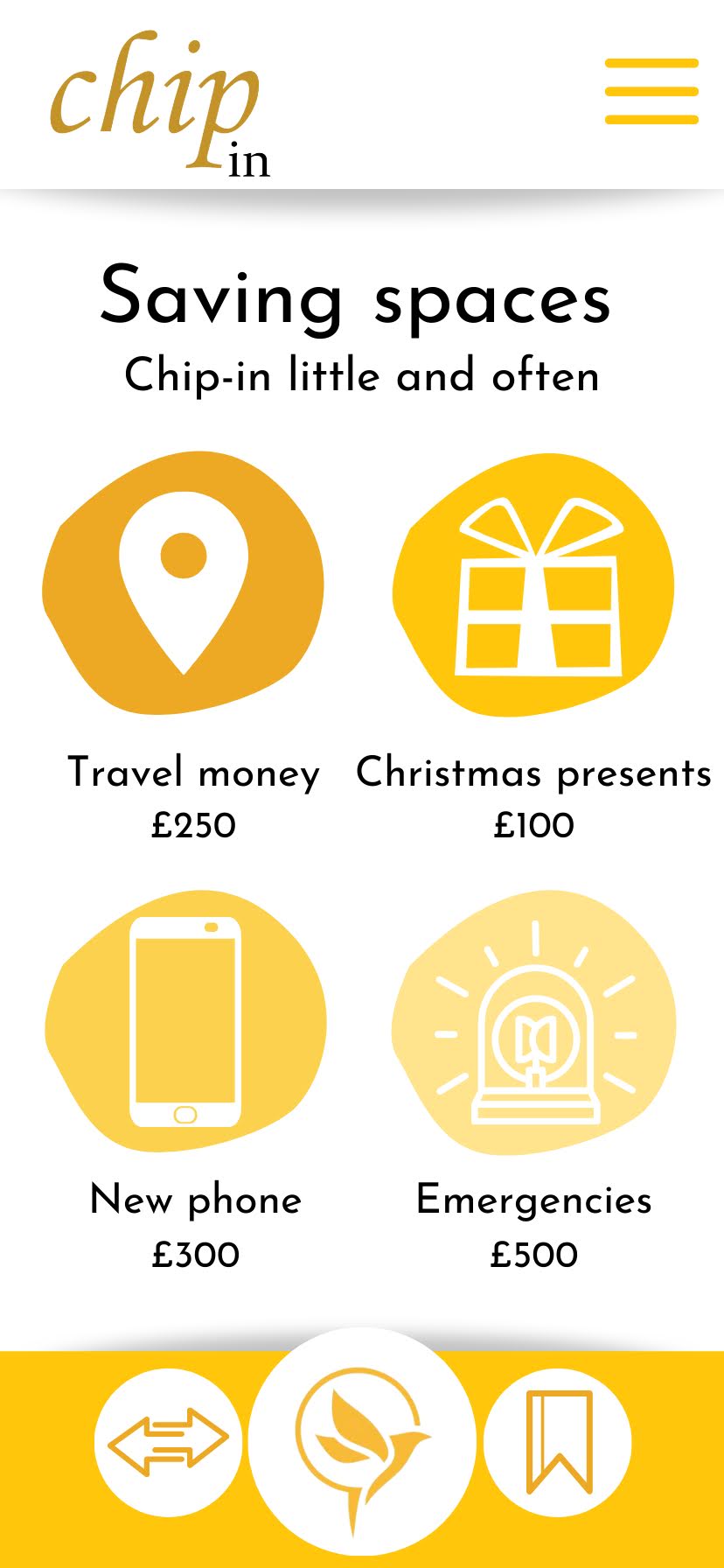
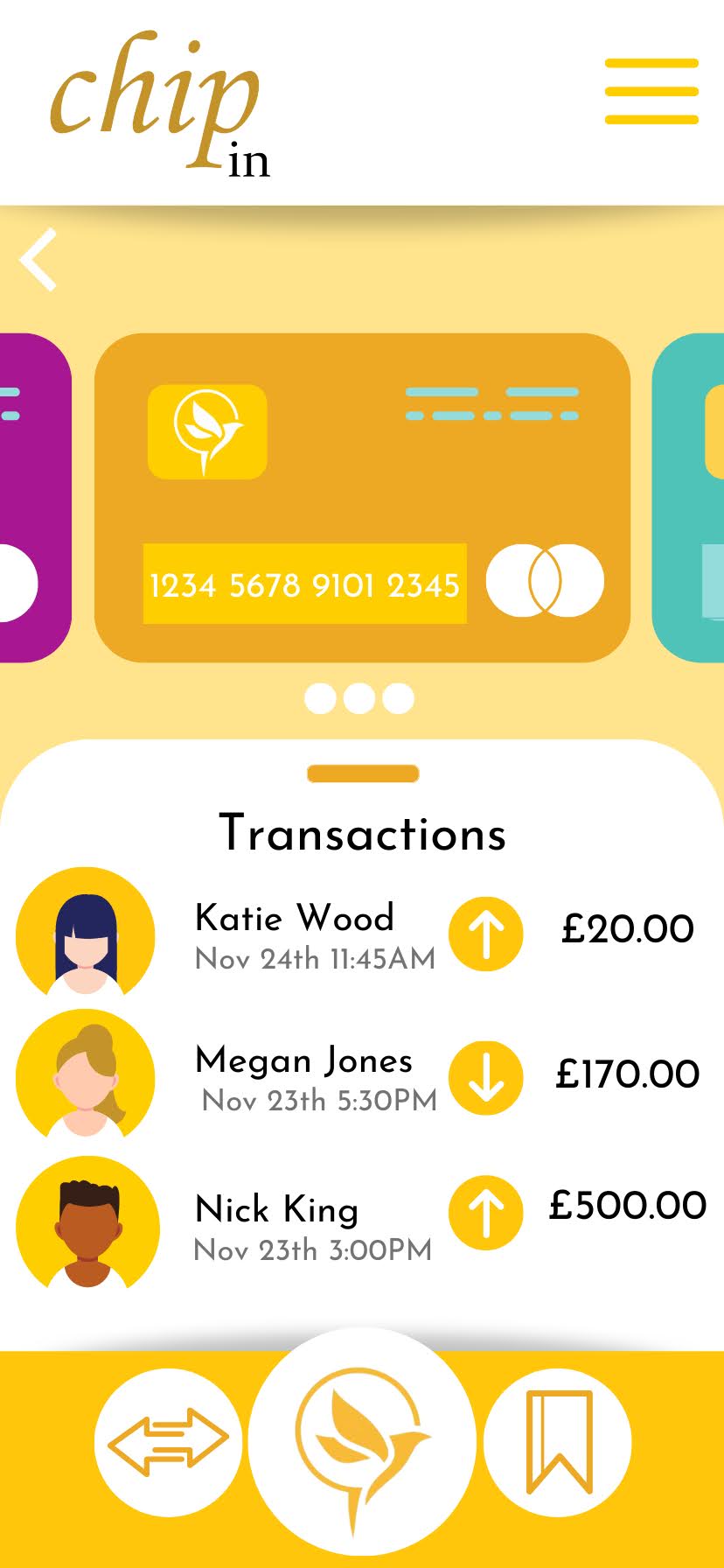
I chose to set it up as 3 slides- the first slide being the login/sign up page, a savings space and the transactions page.
Branding
The experience features a golden yellow colour scheme with our logo being a gold bird. This was to symbolise heading towards the future with this being the future of banking. We knew that we wanted this colour scheme to be consistent across the experience, so I chose out various shades of this golden yellow to use in different areas. The gold symbolises status and wealth which we hope to bring for the customers.
The font we chose for the logo is an italic font to tie in with the fluidity of the birds movement and matches the gold colour as well, and the text used throughout the designs is a simple sans-serif font for easy readability.
Landing page
The landing page features a simplistic design of a white background with different waves of yellow increasing in opacity as it gets closer to the bottom. I wanted to ensure that the logo was the central point of this design, however looking back on it, I would now change the subheading to be underneath the logo writing as it looks squished at the top.
Savings Space
The idea of savings spaces comes from Starling banks app, a company who have executed saving spaces perfectly. The saving spaces mean that you can't accidentally spend your savings and you can also automatically top them up to keep you on track with your savings goal. The icons are customisable as are the names but if I was to redo it I would probably have it as a progress bar showing you how close to your desired amount you are getting. This is not only motivating but helps you to understand the information without taking up much energy. The bottom bar features 3 buttons- payments and transfers, home page and saving spaces.
Transactions
This slide shows the different cards/accounts that the user is currently using and their individual transactions per card. It shows who you are paying, how much and if anyone has paid you. The date and time means its easy to understand but because its in grey it's a side thought if you still need the information which improves efficiency. Again the slide features the same top and bottom bar.
Navigating Complications
Technical Issues
During the project we ran into some technical difficulties. The main one being that we have no way of showing what the wearable technology would look like or what this experience could look like. We thought about using the college's AR headsets to give a demonstration of this but soon realised that this would be too ambitious given the timeframe we were working within.
To solve the problem of not being able to visualise what the concept would look like, I utilized the research I had conducted at the start of the project about mobile banking and decided to create our own version of this. I used the basic structure that most of them feature and then customised it to our needs and what features we wanted to include.
Absences due to covid
Due to the pandemic, we had to deal with a large amount of unexpected absences within our group. We never had a week when everyone was in, we always had someone missing from our group. This meant that we had to rely on other forms of communication such as our group chat to communicate with the team and fill everyone in on what we did that session. This was tough as we had some team members who weren't very communicative with what their plan of action was, and they were the ones that were typically off. This was particularly frustrating for me as the team leader of the group so I needed to be informed of each members progress. As a result of this, it ended up being that a lot of the work was done at the last minute and I ended up doing most of the work for the project.