Apple Application
During June 2022, I was browsing LinkedIn and I found a job application post for an International European Marketing Associate with Apple. Reading through the job description, I could feel my skin start to tingle with electricity, it was the perfect fit.
The first stage of the application was to send in your CV and cover letter explaining why you would be a suitable match for the role, and you could create it as creatively as you want. So naturally the clogs started turning in my head. I scrolled through other peoples Apple Applications to generate some ideas. None of them stood out to me and then I found Andrew Chapman's.
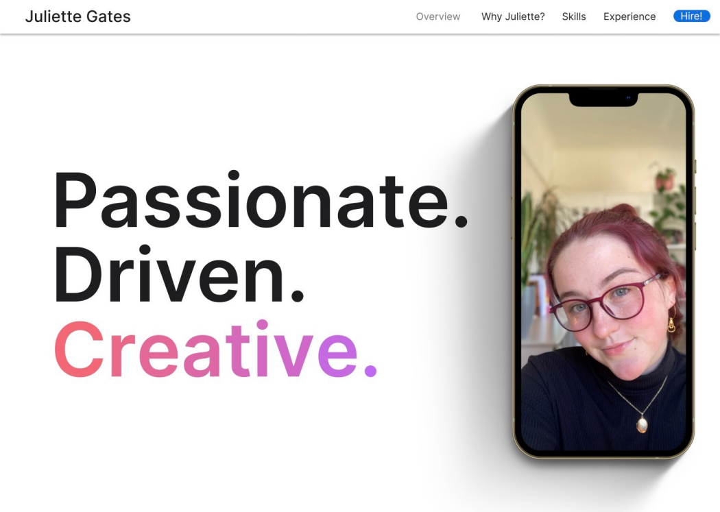
Andrew was applying for a Marketing Associate Internship and had created a version of Apple's website with his information and a selection of pages featuring his information. This got me thinking, if he could do this, why couldn't I? Andrew has a degree and extensive experience behind him whereas I was just a Business BTEC student. But I didn't let that stop me.
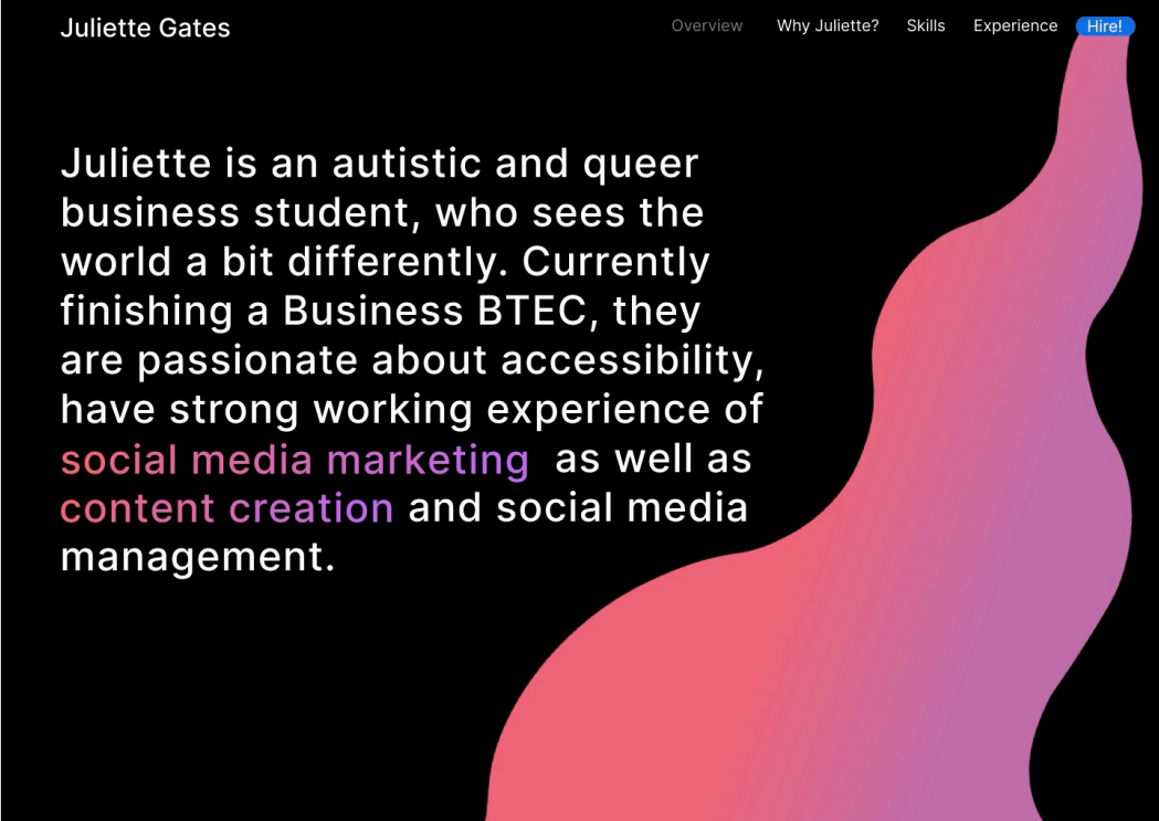
I started to pick apart Andrew's design, looking at what aspects I liked and found visually appealing and what aspects I wanted to change for mine. I found Andrew's work lacked the colourfulness that I would expect with a creative brief, even if it's for Apple, it still needs pops of colour. This is one of the main things I brought into my designs.
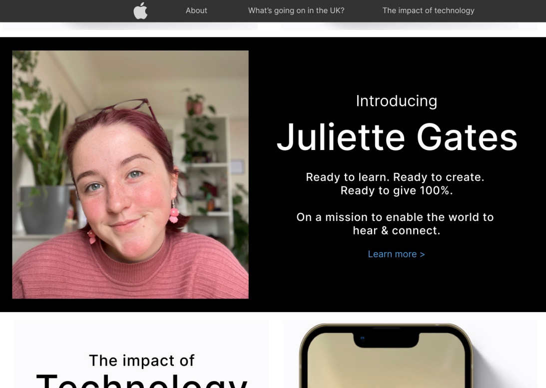
After looking at Andrew's design, I analysed the Apple website, looking at all of their individual pages, finding the hex codes for different elements, finding the exact fonts that they use so I could truly replicate how the apple website looked. I spent hours trekking through each page of the Apple website until I found the inspiration I was looking for. I came across the page for the iPad Air. It was a seamless experience with white and black contrast paired with pink to purple gradient graphics which brought your attention to the perfect spots on the page. It was carefully constructed to keep your attention as users.
After analysing Andrew's work and the Apple website, I was able to start coming up with designs and wireframes of my own of what I wanted it to look like.
It didn't take long for my ideas to quickly become reality. I dedicated all of my free time to working on the website designs, using Figma. Every element was carefully chosen, every colour picked to match Apple's and researched what fonts best replicated SF Pro, which is only available on IOS devices as its Apple's custom font. I manged to find Inter which worked as a very good lookalike for SF and was available on all of the platforms I was developing my designs on.
I sent in my application, not thinking much of it, just thinking that it would be an incredible opportunity if I got it but if not then it's great work to put onto my portfolio (which it is!), and a few weeks later I got an email back from them. They had had over 2,000 applicants for the job position, and I had made it through to the second stage! This stage only contained around 50 applicants so I had done an incredible job to get to that stage.
Unfortunately the second stage was the final part of my Apple journey as I was unsuccessful in that stage, however I still think it's incredible that I made it that far as an 18 year old business student with no prior experience going up against industry experts and people who have degrees behind them. All in all it was a great experience and I am so happy with how my work has turned out.